Tuesday, 15 December 2009

Seed Packaging

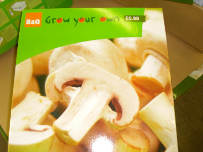
Here is a selection of existing seed packaging. Some photos i took and some are from the internet, which is stated below each image. 


My Photo (B&Q)


My Photo (B&Q)


My Photo B&Q


My Photo (B&Q)


My Photo (B&Q)


My Photo (B&Q)


My Photo (B&Q)


Google Images


Homebase website


Google Images


Google Images


Google Images


MUJI Packaging

Below are some images of MUJI packaging where they use liniar drawings and silhouettes on the packaging, of what it is selling. This is where i got the idea of using fruit silhouettes on my packaging. 


Existing Metro Adverts


Sunday, 13 December 2009

PJ smoothies- Research


Below are some existing adverts that help me come up with my final concept, and the photos i took of the fruit dropping in liquid. 


Wednesday, 11 November 2009

Ricardo at work

Below are images from Ricardo (the personal trainers) website. He is showing how kettle bells can be used, different exercises that you can do at home. Also below are some videos of him in action. 


Existing Logo

 Above is the existing logo for the personal trainer I am doing this brief for. When he first contacted me, it took me a while to convince him to get away from the the symbol on the left, which was supposed to look like a kettle bell, but personally i feel it looks like a peace sign. He was adamant he kept with the red, black and white colour theme, something i will consider when redesigning his logo. The line through the type was supposed to give it a sense of movement, but what i have explained to him is that you can give type a sense of movement by simply choosing the correct type face. Over all i feel that this logo does not work at all, and is in desperate need of a makeover. 
Business Card


Above is a business card i found when researching for a personal trainer. I really like this, i feel it has a simple and effective concept, making it interactive so the personal has to pull it open to read what it says, interactive getting the potential clients intrigued. I feel it is very different and really stands out.